Executive Director Rob Ribbe Introduces New Logo
June 18, 2021
As part of the brand refresh, HoneyRock has unveiled a new logo and a new name—HoneyRock, Center for Leadership Development.
Unveiling a new logo today, Wheaton’s Center for Leadership Development has announced a refreshed brand, including a new name: HoneyRock Center for Leadership Development. This new name better encapsulates the organization’s historic focus as an “experiential leadership laboratory” for youth through summer camp programs and its expanding leadership development programs for students of all ages, including undergraduate and graduate students.
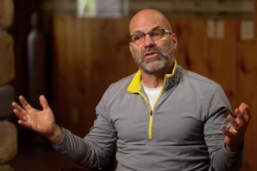
 “In recent years, our experientially based formational programs have expanded significantly beyond the summer months,” said HoneyRock Executive Director Dr. Rob Ribbe.
Over the past six years, HoneyRock has launched the M.A. in Outdoor and Adventure Leadership and a second M.A. in Global Leadership - Outdoor Ministry Track as well as its Vanguard Gap Year program. These additions build on HoneyRock’s programs for undergraduate college students including the three-month School of Adventure Leadership training (SALT), the Summer Leadership School (SLS), and an undergraduate Leadership Certificate of Wheaton College. The college students in these programs lead HoneyRock’s camper programs, which will serve nearly 1,000 youth this summer.
However, Dr. Ribbe is quick to add that HoneyRock’s mission of “building the church and benefiting society worldwide by fostering the development of whole and effective people through transformational outdoor experiences” remains the same.
“We are still committed to launching resilient, connected disciples who make disciples through our experiential leadership laboratory,” Dr. Ribbe said. “With this brand refresh, we hope we can share that transformational experiences are not only for those who participate in summer camp programs, but also for emerging adults and established ministry professionals.”
![]() The new logo, which is optimized for digital platforms, uses rich golden and blue hues in the shape of a canoe paddle blade. The HoneyRock bridge, emblematic of the beloved Cathedral Pines outdoor worship area, is also depicted. “The view of the beloved HoneyRock bridge, pointing towards the sun, represents the movement of growth and development towards being called, commissioned, and sent,” Dr. Ribbe said.
The new logo, which is optimized for digital platforms, uses rich golden and blue hues in the shape of a canoe paddle blade. The HoneyRock bridge, emblematic of the beloved Cathedral Pines outdoor worship area, is also depicted. “The view of the beloved HoneyRock bridge, pointing towards the sun, represents the movement of growth and development towards being called, commissioned, and sent,” Dr. Ribbe said.
The redesigned website is similarly clean and bright, using the same golds and blues depicted in the logo, and which also complement the colors that define Wheaton College’s new brand personality.
"Ultimately, my hope for the brand refresh is that it awakens people to the historic mission of HoneyRock--to facilitate the development of whole and effective youth, emerging adults, and ministry professionals to build Christ's church worldwide. “Dr. Ribbe said.
--Emily Bratcher